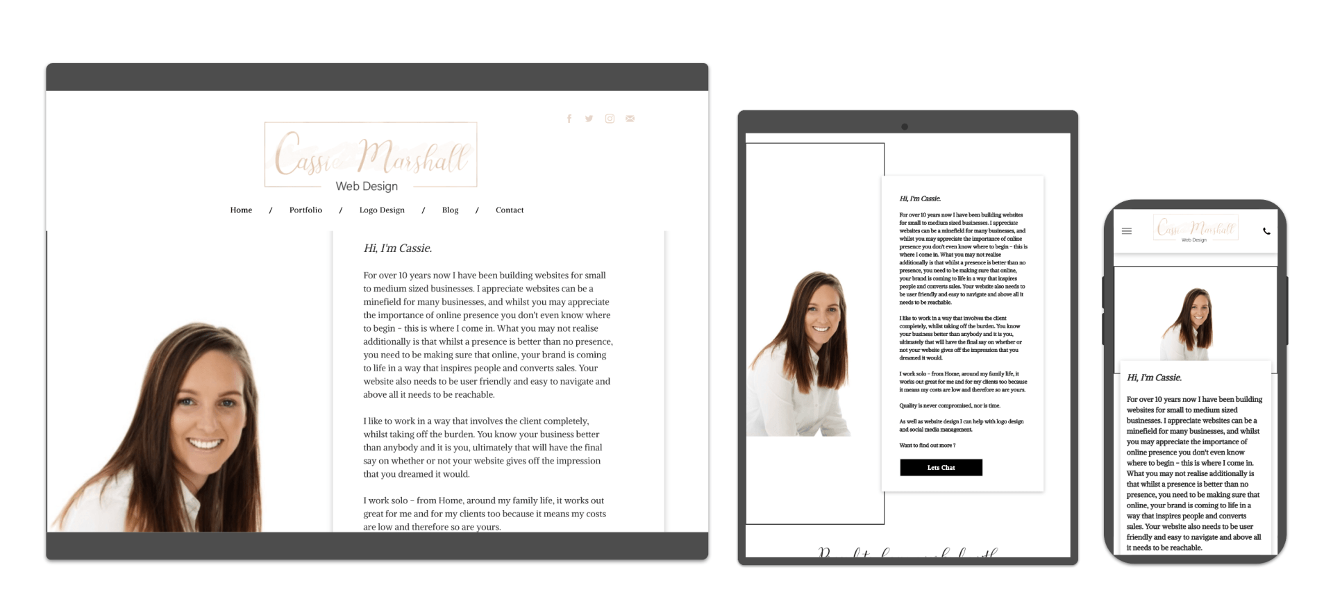
WHAT IS RESPONSIVE DESIGN?
Responsive design, simply put, enables your website to fluidly adapt to different screen sizes. Responsive design makes websites adaptive across a wide range of devices that are used to browse the internet, such as of desktops, laptops, tablets and mobile phones.
a website needs to be user-friendly on a smartphone.
This includes mobile design elements such as:
- readable text without requiring zoom,
- adequate space for tap targets,
- and no horizontal scrolling.
WHAT ARE THE BENEFITS?
The number one benefit of a responsive layout is the guarantee that any user on any device will have the best experience possible on your website. And, the most consistent.
Website responsiveness is also a great way to refine the content on your site, making sure that those using a mobile device are only seeing the most essential information.
Personally, I also prefer the look of responsive site on a mobile. Its cleaner, sleeker and gives off a more professional presence.
Another big benefit of a having a responsive site is search engine ranking .....
DOES NOT HAVING A RESPONSIVE SITE AFFECT MY GOOGLE RANKING?
YES!
Google rolled out a change to the search engines algorithms in 2015 !! Which now factor in a website’s mobile presence as a ranking signal. With the Google algorithm update, a responsive web design increases visibility on search engines—because it is mobile-friendly. A site with an effective mobile experience will show up in search results above one without.
in 2019, a non responsive website looks outdated, messy and leaves the user frustrated. If you haven't already made the move it would be a good idea to and it needn't be as expensive as you think either. I build responsive sites from just £249.00 and existent clients also get a discount on that to move over.
Cassie X
Firstly, and probably the main reason you are considering creating a site yourself is because it seems the most cost effective way. Some sites offer free packages, but include a search engine unfriendly and unprofessional domain, such as www.mycompany.theircompany.com Google hates these domains and although people will be able to access your company site if you give them the address, they are unlikely to find it any other way. It also looks unprofessional and can really put people off as it gives the impression it is not a serious business. There is also the issue of advertising, there will be banners on your site advertisting said company - which nobody appreciates. You are also limited to how many pages you can have, email accounts and also no option for a shop or other features.
You can get packages that offer all of the above - but when you consider the monthly fees I charge are around the same you can see it doesn't work out to as cost effective as you first thought.
The second thing to think about is TIME. Building your own site takes up a lot of time, especially if you have limited knowledge to begin with. Time, when running a business, as you know is sacred and there never seems to be enough hours in the day as it is, so if you're short of time or frankly, have more important things to be getting on with, then let someone else take control of the website side of things.
There a many other things to consider when looking at building your own site such as DESIGN, SEO, FEATURES & SUPPORT all of these things will likely be lacking if you're inexperienced and looking to build a site yourself. However, in terms of building your business, getting online presence and giving off a great impression these are PARAMOUNT.
To find out more how I can save you time AND money as well as building you a stunning, functional, effective website call me today on 0750 2222 308 or email info@cassiemarshall.co.uk
1. It is not personal to YOU
Your business, whether it be weight loss or skin care products is extremely reliant on the quality of the products you are selling and whilst its a very important factor in the success of your business, have you ever heard of the saying ' People buy from people.' your business is YOU. It ia s the audience you have and the trust and rapport you have with people. Unfortunately, having a good product or business opportunity is not always enough to make you successful ( otherwise, everybody would be killing it in your company )
When you have your own personal website that builds personal brand first recruiting and selling becomes a whole lot easier.
2. Your replica site is not designed to convert cold traffic.
There is an overload of information on your replica site making it difficult to put the right information in front of the right people ( the first rule of marketing ) You will want to ensure that whether someone is looking for a business opportunity or an amazing face cream, that the information you put in front on them is relevant to them. You would not sell the same to these different groups of people would you ? And so, your website needs to follow suit. By overloading prospective customers with information they are not interested in, you have less chance of keeping that person engaged and therefore will most likely lose them altogether.
3. Your replica site is limited AND you don't own it
Replica sites are standard templates, they do not always give you the opportunity to post things such as blogs, vlogs, event photographs, event details and most importantly all your leads that you collect from that site, also go to your affiliated company, if something was to ever happen to that company or you had to leave or move elsewhere, all those leads would stay there and not with you. So it makes much better business sense to have your own site with all the details you collect from that site solely in your possession.
4. Competition
The last reason and probably the biggest is the fact the market is booming with MLM opportunites the majority of which are using the exact same site as you ( or equivalent if they use a different model ) you need to ensure you stand out from your competitors , be unique and drive your business in a completely fresh new direction that grabs peoples attention.
To find out more about how I can help your business email or call me today for advice and a free no obligation quote.